As much as we don’t want to admit it, signs work on us. A survey from Outdoor Signs America revealed that 8 in 10 customers report entering an unknown store or business for the first time based only on its sign.
Their effectiveness has seen more than a century fly by, as the Out of Home Advertising Association of America was created in 1891 and has followed how signage evolved across the decades.
But among a sea of bright colors and messages more enticing than the next ones, how can you make a difference to avoid missing your next customer?
Today we share 7 business signage tips from research conducted by the experts at Signs.com who tested drivers’ responses to different qualities of outdoor business signs. These include text length, size, color, and levels of engagement, among the variables tested.
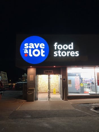
.jpg?width=540&height=360&name=DSC_1988%20(1).jpg)
High Color Contrast
Color matters. Signs with high color contrast between background and text had a 23% boost in responses. High contrast attracts the eye more quickly, so keep in mind where your sign will be located and how it contrasts with its surroundings.
To help you choose the color(s) matching your message, we suggest some reading on Visme to go through more details on the link between colors and marketing signage.
No Borders
While adding a border to your signage may seem like a minor tweak, it actually seems to distract drivers. It adds more noise to the picture that readers have to process, and it doesn’t give any more information than a borderless sign. In fact, signs without borders had 11% more engagement. Opt for a borderless design for a cleaner, more effective sign.
Short Messaging
When it comes to business signage tips, simplicity is key. People generally don’t take time to read signs in-depth (and motorists definitely can’t stop to read them), so the messaging on outdoor electronic signage, like a digital message center, must be as simple and direct as possible.
You only have from the time viewers see the sign to the time they walk or drive past it to get your message across, about 5 - 10 seconds.
Viewers need to notice, read, process, and comprehend the sign in that window of time. That’s why short, simple messaging was found to be 20 times more effective. With this in mind, avoid writing full sentences on digital message centers. For example, "Are you tired?" can easily be shortened to: "Tired?".
Larger Signs
Bigger is better. Unsurprisingly, physically larger signs also drove more engagement. They are easier to notice and easier to read, which reduces the time needed to process and act on the sign, especially if your sign indicates the location of your store nearby.
Larger signs drive 75% more engagement compared to smaller ones. When designing your pole signs or channel letter signs, remember that larger signage helps people process the information faster and act on it.
Low-Involvement Call to Action
The simpler the action, the more likely people are to follow through. In the experiment, a sign that asked drivers to wave had 2.5x more engagement than asking them to honk their horn. This example shows us how the most effective messaging can be as simple as "Next Right". So be direct, but don’t ask too much from your readers when selecting messaging for your digital LED sign.
Simple Design
Although graphics can boost engagement, too many can reduce readability. Signs with concise text and a single-color background were up to 40% more effective. Although a background image can draw attention, it can also reduce the contrast of the words. Avoid background images that may reduce contrast and make the text harder to read. Keep your design simple and impactful.
Proper Illumination
Your sign should be visible 24/7, not just during the day. Traffic doesn’t stop when the sun goes down, but if people can’t see your message, it’s the same as not having a sign. Consider investing in high-quality, energy-efficient lighting that will make your sign more visible at all times of day. Both internal and external lighting options are available, depending on the sign type. By adding sufficient lighting to your commercial sign, it effectively becomes an all-day advertising tool.

Bonus Tips: Location, Visibility and Quality
A key component to sign effectiveness is location. Of course, areas with more traffic are better for putting your sign, but there’s more to it. Here are a few additional business signage tips:
- Visibility: Is it big enough? Can it be seen easily from a distance? Does it require commercial lighting?
- Fonts: What font(s) are you using? Note that using CAPS does not necessarily equate to higher readability.
- Obstructions: Are buildings, tree limbs, or other items blocking the view of your sign?
- Condition: Does it need to be repaired or replaced? Ensure your sign is in good condition. Poor signage can deter potential customers.
- Exposure: How long will the average person spend looking at your sign? Do drivers have enough time to act on your sign’s message safely?
Last number to remember: the aforementioned study from Outdoor Signs America also reveals that more than 65% of consumers admit matching the quality of a product or service with the quality of the business signage, and 50% of those surveyed said that poor signage would even deter them from entering a business completely.
Although these business signage tips will help you design a more effective sign, successful production and installation require expertise. You can reach out to our team at Flexlume to get expertise and guidance in making the best, most effective sign for your business.
